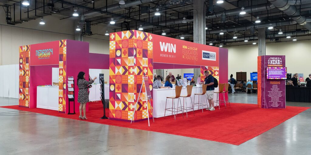
The Power of Visual Branding in Event Marketing
Visual branding plays a direct role in how people recognize, evaluate, and remember a business at an event. At trade shows, conferences, product launches, and promotional activations, companies often compete for attention within the same physical space. A consistent visual identity helps visitors identify a brand quickly and understand what it represents.
Effective event branding requires more than placing a logo on a banner. Color, typography, layout, materials, lighting, and signage must work together. When these elements follow a clear design system, businesses can create a recognizable presence and support their marketing objectives.
Why Visual Branding Matters at Events
Event attendees make quick decisions about which booths to approach. Clear branding helps them distinguish one company from another before a conversation begins. It also creates continuity between the event experience and the company's website, advertising, and social media.
Consistency is particularly important when a business participates in multiple events. Reusing the same core visual elements makes the brand easier to recognize over time. However, consistency does not mean every display must look identical. Each setup can adapt to the venue while retaining the same colors, logo treatment, typography, and messaging.
Build a Consistent Visual Identity
An effective event design starts with established brand guidelines. These guidelines define how visual elements should appear across physical and digital marketing materials.
Start by identifying the elements that must remain consistent:
- Logo placement: Use approved logo files and maintain adequate clear space around the mark.
- Color palette: Specify brand colors using Pantone, CMYK, RGB, or HEX values as appropriate for each production method.
- Typography: Limit typefaces and establish a clear hierarchy for headlines, supporting text, and calls to action.
- Imagery: Select photographs and graphics that reflect the brand's positioning and target audience.
- Messaging: Use a concise value proposition that visitors can understand at a glance.
These specifications reduce design inconsistencies between vendors, printed materials, and digital assets. They also simplify production when marketing teams need to prepare displays under tight deadlines.
Turn Event Displays Into Branding Assets
Every visible surface at an event contributes to the overall presentation. Booth backdrops, banners, product displays, signage, staff clothing, and registration tables can reinforce the same identity.
Table coverings deserve particular attention because they occupy a central position in many exhibition booths. They also provide a practical surface for displaying promotional materials, demonstrating products, or speaking with prospective customers. Using custom table covers can help businesses extend their branding to these frequently visible areas.
The right format depends on the event environment. A fitted cover creates a structured appearance, while a stretch cover can provide a smooth finish. A traditional table throw may offer more flexibility for different table sizes and event layouts.
Artwork should be designed for the actual viewing conditions. Place the logo where attendees can see it from common approach angles. Keep important text away from folds, seams, and areas that may be hidden by chairs or stored materials. Avoid overcrowding the design with several competing messages.
Connect Physical Branding With Digital Marketing
Event branding should continue beyond the booth. Digital promotion before, during, and after an event can extend the reach of the physical display.
Use the same visual identity across event announcements, landing pages, email campaigns, social posts, presentation slides, and follow-up messages. This consistency helps attendees connect the experience they had in person with later communications from the business.
Photography is another important consideration. A well-designed display can appear in event recaps, product demonstrations, customer testimonials, and promotional videos. Keeping the booth uncluttered and ensuring the logo is visible makes these assets more useful for future campaigns.
Apply Design Principles That Improve Visibility
Strong event graphics use visual hierarchy to direct attention. Visitors should be able to identify the company, understand its primary offer, and locate the next step without studying the display for an extended period.
Contrast is one of the most useful tools for achieving this. A clear difference between foreground and background helps logos and text remain legible under varied lighting conditions. Typography also matters. Small text may look acceptable on a computer screen but become unreadable from several feet away.
Adobe's guide to color contrast in design explains how differences in color, brightness, and saturation help establish hierarchy and improve readability. These principles apply to event signage, printed graphics, and branded displays.
Before production, review the design at its intended physical size. Check logo clarity, text legibility, color consistency, and the distance from which key information can be read. A full-size proof or sample can reveal problems that are difficult to spot in a design file.
Make Every Visual Element Work Together
Visual branding is most effective when every component supports the same message. Consistent colors, readable typography, carefully positioned logos, and coordinated displays help businesses present a clear identity in competitive event environments.
The objective is not to add more graphics. It is to make the right information visible, recognizable, and easy to understand. With a defined design system and measurable goals, businesses can turn event materials into practical marketing assets that support recognition, engagement, and lead generation.

