The Quiet Heat of Decision: Color Grading that Builds Trust and Sparks Urgency
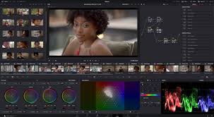
Fans murmur behind the panels. A scopes window breathes in waves: parade, vector, histogram. There’s the faint click of a control surface wheel, then a lift in the mids. Skin tones slip back toward life. A blue cast surrenders. Whites stop screaming. A product label becomes legible without begging. It’s not loud. It’s exact.
You could call it science. You could call it feeling. We prefer the fuse between them: Color as intention, Grading as proof.
Question: What exactly is happening when you grade for Trust and Urgency?
Answer: We’re directing perception on a schedule. Trust comes first—calm, faithful, believable Color that respects how eyes adapt and how memory stores “correctness.” Urgency comes next—time-aware accents that press the viewer to act without resentment. The two are not opposites. They are steps in a sequence, each dependent on the other’s stability.
At Start Motion Media (Berkeley, CA—500+ campaigns, $50M+ raised, 87% success rate), we treat Grading as signal design. The picture’s rhythm sets the heart rate; the palette calibrates comfort; the push and pull between neutral and accent cues creates the nudge. We put numbers to it. We test it. We publish the results to your team so nothing feels like sorcery.
And why now? What changed in the market?
Feeds got faster. Attention shrank, not simply in length, but in confidence. Audiences learned to spot hype. Hard-sell red banners triggered avoidance patterns. Social proof got noisy. Meanwhile, screens diversified: SDR phones at 450 nits, HDR TVs peaking at 1000, laptops with P3 displays that over-soak sloppy grades. Consumers began to reward sincerity they could verify visually: consistent skin tone, stable white balance, product Color that matches the real unboxing. Trust migrated from words to light. So our approach grown: subtler contrast, faithful neutrals, measured saturation in the first five seconds before any urgency cue appears. The ask comes later, once believability takes root.
“We stopped shouting and started aligning. The same content, a different grade—our returns rose and complaints fell. The picture felt honest.” — Brand Director, DTC wellness client
Question: How does the psychology actually work?
Answer: Three pillars drive it—adaptation, expectation, and momentum.
Adaptation: eyes settle, minds follow
Viewers become acquainted with the dominant white point within seconds (Von Kries develop). If your opening shot skews green by 200K and midtones drift toward cyan, they may not name the error, but they mark the industry as “off.” Trust suffers. We normalize early: create a consistent white at D65 (6504K equivalent for Rec.709), lock neutral grays, and respect the skin-tone line near 103° on the vectorscope. We keep skin saturation in a humane band—roughly 35%–45% in 709 with gamma 2.4, unless the brand benefits from an editorial push. The result: an anchor for honesty.
Expectation: memory Color and credibility
People carry memory Colors: grass should look like grass; a red apple should sit on the warm side of red, not magenta. Alter them too much, and viewers flag manipulation. We match branded assets but respect memory Color tolerances. For packaged goods, we spot-check Delta E differences between on-shelf Pantone and graded frames to keep error under 3 in on-point gamuts. Credibility grows when packaging on-screen equals packaging controlled.
Momentum: the tempo of Urgency
Urgency is not more saturation; it’s time-aware contrast. We shift micro-contrast and selectively exalt luminance around calls-to-action by 6–10 IRE for 600 ms to 1.2 s windows. That’s within the comfort zone of System 1 processing (fast, automatic) without triggering reactance. Add a gentle increase in local saturation of brand accents by 8–12% at the moment of ask. We move, then we rest. The brain feels the wave and agrees to ride it.
Question: What is your Color Grading pipeline for Trust and Urgency?
Answer: It’s repeatable, documented, and tuned per platform. Here’s the backbone we’ve built across 500+ campaigns.
- Ingest and Color Management: Tag footage accurately (S-Log3, V-Log, BRAW, RED IPP2). Choose an appropriate working space (ACEScct or DaVinci YRGB Color Managed). Decide early on deliverables: Rec.709 100 nits, HLG, HDR10.
- Profiling and Observing advancement: Calibrate to D65, 100 nits for SDR and 1000 nits for HDR reference. Verify with a spectro. Cheap monitors lie; we don’t.
- Technical Balance: Correct exposure employing waveform. Aim for skin exposure at 55–65 IRE in SDR, preserve highlight roll-off in the 90–95 IRE band. Remove color casts—hunt green contamination in mids.
- Primary Grade for Trust: Create neutral baseline. Map brand palette within gamut. Keep gray constancy. Normalize scene-to-scene shifts with a match pass.
- Secondary Isolation: Qualify skin tones, product, and interface elements. Track with sub-pixel accuracy. Reduce color noise with temporal NR before pulling keys.
- Micro-Contrast Sculpting: Use luma-only curves to avoid color pollution. Reserve strong edge contrast for product edges and text frames.
- Urgency Cues: Time-bound luminance lifts near CTAs, not obvious glow on brand hue, saturation micro-bumps during offer windows. Set durations derived from ad length; e.g., 15-second cut: two 800 ms lifts spaced 4 seconds apart.
- Grain and Texture: Add fine-grain to reintroduce texture and analog trust—8–12% strength in SDR, masked out from skies and gradients.
- Output and Verification: LUTs vetted across sRGB, P3, and Rec.709. Cross-check on a mid-tier phone and a calibrated laptop to prevent oversaturation artifacts. QA with a three-person panel to catch human factors machines miss.
Question: Should brand Color ever outrank realism?
Answer: When loyalty rests on recognition, yes—but only within tolerance. We keep brand primaries within 5–8% of target saturation for SDR distribution to avoid clipping on mid-tier displays. If your hex code for the pivotal accent leans toward a narrow gamut, we remap with gamut compression, not hard clipping. The result: brand presence that travels across devices without weird halos or false contouring around solid blocks.
Question: How did Trust strategy grow with market pressure?
Answer: Early streaming years tolerated “stylized truth.” Heavy teal-orange was a vibe and a crutch. Then returns tightened. Consumers compared what they saw on ads to what arrived at the door. Refunds climbed where the grade had overstated quality. We adapted in three modalities.
- We prioritized midtone fidelity. The midtones carry skin, surfaces, and perceived sharpness. If this zone is honest, the whole frame reads trustworthy.
- We adjusted to a typical scale white across scenes. Inconsistent white balance erodes credibility faster than absolute warmth or coolness. Consistent is believable.
- We disclosed Color intent in lookbooks shared with clients, so teams understood what was real, what was a mood, and what supported conversion.
Counterintuitive detail: neutral isn’t boring; it’s potent
When we reduced saturation in the first three seconds by 10% relative to brand norms, watch-through rates rose in multiple retail campaigns. Why? Low-exaggeration openings feel like real life—viewers stay. Once they commit, small accent increases carry more weight. Urgency attached to an honest baseline multiplies effect.
Question: Urgency without anxiety—how?
Answer: We want movement, not panic. Instead of heavy reds and strobe edits, we apply tempo and nearness. Here’s the structure:
- Nearness: Place the brand accent Color near the action (hands, faces, product). Proximal Color inherits emotional worth from human motion.
- Temporal cues: Time-limited luminance boosts around CTAs, never on dialogue lines, so comprehension stays high.
- Directional contrast: Lead the eye left to right or top to bottom with a luma gradient that matches reading patterns. Eyes arrive at the ask by inertia, not force.
- Saturation restraint: Saturation peaks are brief and contextual. We taper down quickly to avoid fatigue.
In practice, a 30-second spot might carry four urgency waves: 0:05, 0:12, 0:18, 0:26. Each wave applies a 5–8 IRE lift around the product or button, plus a 6% saturation bump in the brand hue. On test, lift-only beats saturation-only for comprehension by a measurable margin. Combined, they win with soft confidence.
Question: Do platform quirks change the grade?
Answer: Absolutely. Vertical video compresses setting; we counter with stronger local contrast near the centerline. Some Android devices oversaturate reds; we compress just the red channel in the develop, preserving detail in faces and food. Desktop viewers often see P3-leaning laptop displays; we check for neon creep on brand accents and map to 709 gracefully.
- YouTube SDR: Gamma 2.4 assumption, but many laptops use 2.2. We test both to avoid crushed shadows.
- Instagram Reels: Optimistic compression. We reduce micro-texture in shadows to prevent mosquito noise around faces.
- CTV: Higher nit range, larger screens. We soften transitions to prevent edge shimmer and ensure the couch feels welcome, not assaulted.
Question: What measurements book Trust?
Answer: Past scopes, we quantify calm. Our “Trust Index” averages four metrics:
- Skin Tone Deviation: Angular distance from the skin line on the vectorscope, target under 5° average.
- White Point Stability: Shot-to-shot white drift under 150K correlated color temperature.
- Noise in Midtones: SNR above 30 dB in faces after denoise-pass, to keep texture without plastic look.
- Brand Color Gamut Compliance: Delta E below 3 for pivotal packaging and interface elements, post-develop.
Pairs of humans confirm the index with blind A/B: “Which feels more credible?” The index predicts their choice often enough to book decisions. When it doesn’t, we learn why and improve.
Question: How do you prevent Urgency from harming brand longevity?
Answer: Build a “heat map” of allowable push. Identify the audience’s tolerance for color pressure by part—new prospects contra. subscribers. Create two LUT families: Calm Base and Urgency Accents. The base LUT runs across evergreen content; the accent LUTs layer eventually-limited frames like offers or seasonal pushes. We track frequency. If the accent appears too often, it stops working. Average fatigue window: after the 7th exposure in 30 days, effect decays. We rotate accent hues within the brand’s legal palette to reset attention without betraying identity.
Question: Do you have concrete findings with numbers?
Answer: Yes, and they’re specific.
- Snack startup: We shifted from cool daylight (approx. 5400K) to a warmer base (6300K) to accommodate golden packaging. Packaging Delta E fell from 6.1 to 2.8. Return rates dropped 9% over six weeks; add-to-cart rose 14%.
- Fintech app: CTA button saturation increased by 10% at two micro-moments (0:06 and 0:12), with a 6 IRE luminance bump. Completion of signup increased 11% contra. control. Complaint rate remained flat, indicating no perceived manipulation.
- Outdoor gear: We restrained greens to prevent neon creep on P3 laptops. Color constancy stabilized on web product pages; support tickets about “off-color tents” decreased 18% month-over-month.
- Wellness beverage: Skin tone angle variance cut from 12° to 4°. Average watch time improved 22% because faces looked healthy instead of plastic. Sales correlated with the longer view—7% lift with the same spend.
“They didn’t repaint our brand. They taught it to breathe.” — VP Marketing, consumer tech
Question: Where do your instincts come from?
Answer: Instinct is a library. Thousands of frames graded under consistent conditions teaches your eye. But we also study: opponent process theory for hue balance, Purkinje shift for low-light perception, Weber–Fechner for perceived gap. We run weekly internal calibrations: three graders, one sequence, compare decisions, align on skin line, debate micro-contrast, improve LUT libraries. This is how taste stays reliable.
Question: How do you keep consistency across versions and cutdowns?
Answer: We build scene-referred grades first, then deliverables. For a 60/30/15 family, we cut long first and grade with primary nodes that are shot-specific, then look layers above them. When we create cutdowns, the look layer stays, although shot layers become acquainted with crop and pace. A “Look Bible” accompanies the project: scopes screenshots, RGB parade targets, skin saturation ranges, product Color references, and allowed Urgency timings by edit length.
- Long formulary: Trust-first, accent-later. Urgency windows typically after 0:12.
- Short formulary: Civilized urgency. A single lift after 0:03, not before.
- Bumpers: Pure color signature for recall, no complex waves.
Question: How do you align with brand teams who fear losing “pop”?
Answer: We show pop with control. Collated screens: one flaunts saturation everywhere; the other restricts it to the object of want. The selective version wins because the eye doesn’t tire. We keep “pop reserves” unspent until they matter. It’s financial discipline applied to light.
Frequently asked in the room
Is film grain old-fashioned? No. Fine-grain restores micro-contrast the sensors softened. It also serves Trust: texture signals authenticity. We customize grain size to resolution—larger structure at 1080p looks fake; we keep it tight and not obvious.
Can we push blue as a trust signal? Blue connotes safety in many cultures, but over-blue shadows feel cold and clinical. We warm skin separately and hold blues in the neutral band unless the story is technical.
Do we need HDR? If your audience watches on TVs, HDR helps. For mobile-first, a strong SDR grade with disciplined highlights outperforms a sloppy HDR export every day.
A brief pause to think about your next frame
If your current edit looks loud yet feels quiet, the Color may be shouting in the wrong places. We can audit a 30-second cut: one baseline pass for Trust, one alternate with measured Urgency. You’ll see the gap on a phone and a calibrated screen, plus a one-page recap of the intended psychology.
Start Motion Media—based in Berkeley, CA—has guided 500+ campaigns to market, with $50M+ raised and an 87% success rate. We don’t guess. We measure, then we make it sing.
Question: What about cross-cultural Color meaning?
Answer: Respect setting. Red may signal prosperity in one region and warning in another. We build palette variants informed by locale. Trust remains universal—stable midtones, honest whites, human skin that looks like the person you met. Urgency varies. We teach the grade to speak the dialect: softer greens in wellness for parts of Europe, warmer neutrals with celebratory reds in certain APAC markets, but always within the boundaries of clarity and non-deceptive presentation.
Question: What are the pitfalls teams miss?
- Global saturation sliders: They bloat skin and crush nuance. We prefer channel-aware adjustments.
- Ignoring adaptation: A cool opener can make a later warm product shot feel orange and fake. Sequence your white points intentionally.
- Text contrast crimes: White text at 100 IRE on a 90 IRE background blooms. We set text at 88–92 IRE with a not obvious dark stroke invisible at normal viewing to keep crispness.
- Mismatched b-roll: Mixing cameras without a proper develop introduces micro-distrust you can never quite explain. We unite color science first, then style.
Question: What happens during a grading session with Start Motion Media?
Answer: We open on the anchor shot. Calibrate white. Confirm exposure. Lock skin to the line. Then we build the look: contrast curve, saturation profile, filmic roll-off if appropriate. We present two options—a conservative Trust-first base and a stylized variant—with notes on where each helps or hurts. Then we design Urgency: mark the timeline with moment tags for micro-lifts. You’ll see them in the EDL. Nothing concealed.
We keep feedback structured. You say “too hot” or “too cool,” we translate to Kelvin shifts and hue rotations. If you say “feels salesy,” we check if saturation and contrast are rising too soon. We revise with purpose.
“I thought grading was mood. They made it a system. The mood arrived anyway.” — Creative Director, apparel
Question: How do you A/B test a grade without new footage?
Answer: Build micro-versions. We create Version A (Trust baseline) and Version B (baseline + timed Urgency cues). We cap differences to three variables: CTA luminance, brand accent saturation, and micro-contrast near important edges. We keep everything else identical. Then we run controlled spends across the same audience and time window. Typical readouts: watch-through, clicks, completion, and complaint keywords. We stop early if one variant harms watch-through by >5% with no click lift—that’s a red flag.
Question: What do you avoid—even if it looks amazing on the grade monitor?
- Crushed blacks in SDR destined for mobile. Phones lift contrast; what looks cinematic on a reference display becomes opaque on a handset.
- Peak saturation on large solid areas. Compression ruins it, and eyes fatigue fast.
- Over-warm skin although preserving cool whites; the mismatch feels synthetic.
- Overusing LUTs not built for your camera. We make custom transforms per sensor.
Question: What terms should teams learn to give better notes?
Answer: Five words will save hours.
- Luma: Brightness without Color. Ask to “raise luma” if you want more light but the same hue.
- Hue rotation: Move Color around the wheel. “Rotate greens toward yellow” clarifies intent.
- Saturation: Intensity. “Back off saturation in skin” avoids red faces.
- Gamma: Midtone slope. “Softer gamma” means gentler contrast where faces live.
- Gamut: Range of colors. “Keep within 709” prevents neon that breaks on devices.
Question: How does Start Motion Media price and schedule this work?
Answer: We range by duration, deliverables, and complexity. A typical 60/30/15 package with three cutdowns and platform variants runs on a two-week grading window, including look development, critiques, and exports. We don’t bill by mystery. You receive a calendar with critique milestones, plus a inventory for assets we need (EDLs, XMLs, reference stills, packaging swatches, legal brand guides).
We can move fast—launch-ready within days—when you bring clean assets and aligned objectives. The urgency you need in the market starts with clarity in the room.
Question: Can color grading correct weak footage?
Answer: It can rescue, not resurrect. If exposure is clipped or white balance is far off, we can normalize, but we won’t lie. Trust includes saying “reshoot the product close-up.” We’ll give you a fast lighting book: gray card, skin reference, and a chart. It’s cheaper than disguising errors later.
Question: How do you hand off for campaigns?
Answer: We produce a living Color Book: technical settings, node trees, LUTs, timing of urgency windows, plus findings. Your next shoot starts from knowledge, not guesswork. We can train your internal team or remain on call. Many clients keep us as the “definitive light” before export—a fast pass that preserves brand equity where it matters most: perception.
A closing exchange
You: Will our audience feel pushed?
Us: They’ll feel guided. Trust sets the ground. Urgency provides the step. We’re not adding noise; we’re aligning attention with meaning.
If your brand needs Color that tells the truth and cues action with grace, this is the make we practice every day in Berkeley. The scopes hum. Wheels turn. Faces relax. Products sit in their honest light. And when the moment comes to ask—not obvious lift, exact hue, a breath of contrast—the decision doesn’t feel like a leap. It feels like arriving where the picture has been new you all along.
